


Standard profile pics improvement
Page 1 of 1 • Share

Standard profile pics improvement
![]() by xNFx Monsta February 13th 2014, 7:49 am
by xNFx Monsta February 13th 2014, 7:49 am
removed :P
Last edited by xNFx Monsta on March 31st 2014, 2:57 am; edited 2 times in total

xNFx Monsta
Re: Standard profile pics improvement
![]() by Stevedoggen February 13th 2014, 11:07 pm
by Stevedoggen February 13th 2014, 11:07 pm
They are good. Like, scary good. Dude, if you can make my emblem in that sorta format, I'd be eternally grateful, they look so cool! (only if you want to, no rush or anything).
If you're interested:
http://fc02.deviantart.net/fs70/f/2014/006/6/d/emblem__1__by_stevedoggen-d717j3d.jpg
And here's my attempt in Flash a while ago
http://fc09.deviantart.net/fs70/f/2013/365/e/5/large_by_stevedoggen-d70ampx.png
If you're interested:
http://fc02.deviantart.net/fs70/f/2014/006/6/d/emblem__1__by_stevedoggen-d717j3d.jpg
And here's my attempt in Flash a while ago
http://fc09.deviantart.net/fs70/f/2013/365/e/5/large_by_stevedoggen-d70ampx.png

Stevedoggen
Re: Standard profile pics improvement
![]() by xNFx Monsta February 14th 2014, 1:55 am
by xNFx Monsta February 14th 2014, 1:55 am
Well lucky for you i get bored very easy (lmao xD )
https://2img.net/r/ihimg/a/img837/8748/rznx.jpg
https://2img.net/r/ihimg/a/img822/7650/ijdt.png
The one with no background is the one I intended for u to use as a profile pic if u wanted to but yeah :I . Im not sure what u meant by in that format but i think this is what u wanted ?? correct me if I'm wrong and il give it another go :)
"Edit" it seems the link to the second one is broken -.- soooooo il have to post it below.... I try avoiding posting images like this since it looks unprofessional and takes up a lot of space :L but oh well xD
xNFx Monsta
Xtralaos- Developer
Re: Standard profile pics improvement
![]() by Stevedoggen February 15th 2014, 12:21 am
by Stevedoggen February 15th 2014, 12:21 am
I hate to have criticism, especially since you're doing it of your own free will (it's constructive though)
I feel it's perhaps a little 'cluttered'.
You have the bird holding the lightning, which is great, looks neat, and the two crossed swords (perhaps the gradient is a little too dark near the bottom of the swords and bird), but then there's a vertical sword, with a circle around it and extra wings? Try one without those extras.
of the 2 you showed, I like the darkish background better than the lightened one.
The strange square-ish shape on the background, but one layer up looks nice though.
Sorry to be a hassle, I like the way it turned out though.
PS: when I meant 'format' I meant the shapes that were on the top and bottom of all your works in the OP. But nevermind that, since I actually prefer what you did instead with the plain darkened background.
Stevedoggen
Re: Standard profile pics improvement
![]() by xNFx Monsta February 15th 2014, 5:19 am
by xNFx Monsta February 15th 2014, 5:19 am
Yeah i agree it does look way too clustered, I have no idea what inspired me to make that third sword in the middle with the extra wings lol i guess i thought it was just a bit too plain :P anyway il give it a re-attempt sometime next week cause I'm just a little busy with my year 11 studies atm -.-
But i went ahead and made some more that day so il post them now..
But i went ahead and made some more that day so il post them now..
xNFx Monsta
Re: Standard profile pics improvement
![]() by xNFx Monsta February 15th 2014, 6:45 am
by xNFx Monsta February 15th 2014, 6:45 am

I made them In blue because they are easier for the user to change the colour, Also blue is my favourite colour C: but that totally has nothing to do with it hehehe.


xNFx Monsta
Re: Standard profile pics improvement
![]() by xNFx Monsta February 15th 2014, 6:53 am
by xNFx Monsta February 15th 2014, 6:53 am
Almost Forgot One ^^
- Spoiler:

xNFx Monsta
Re: Standard profile pics improvement
![]() by Stevedoggen February 16th 2014, 4:09 am
by Stevedoggen February 16th 2014, 4:09 am
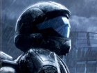
very nice. inspired from the Halo 4 ones? Some look identical to what i remember in H4.
Stevedoggen
Re: Standard profile pics improvement
![]() by xNFx Monsta February 16th 2014, 6:55 am
by xNFx Monsta February 16th 2014, 6:55 am
Yeah all of these emblems or profile pics were made to look as identical as possible to the ones in halo 4 :) i think I'm going to try a few from the ones in halo 2 or halo 3 ODST they looked pretty decent But il have to do that sometime next week cause of school -.-

xNFx Monsta
Page 1 of 1
Permissions in this forum:
You cannot reply to topics in this forum